IMG Models Men FW20
Visual identity & Branding (2019)
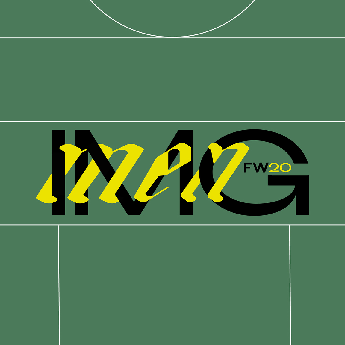
This visual identity concept inspired by the geometry of sports fields and the energy of movement. Lines are deconstructed and reimagined to create a vibrant, graphic universe. Typography follows the same logic (mixing styles to reflect motion and disruption).
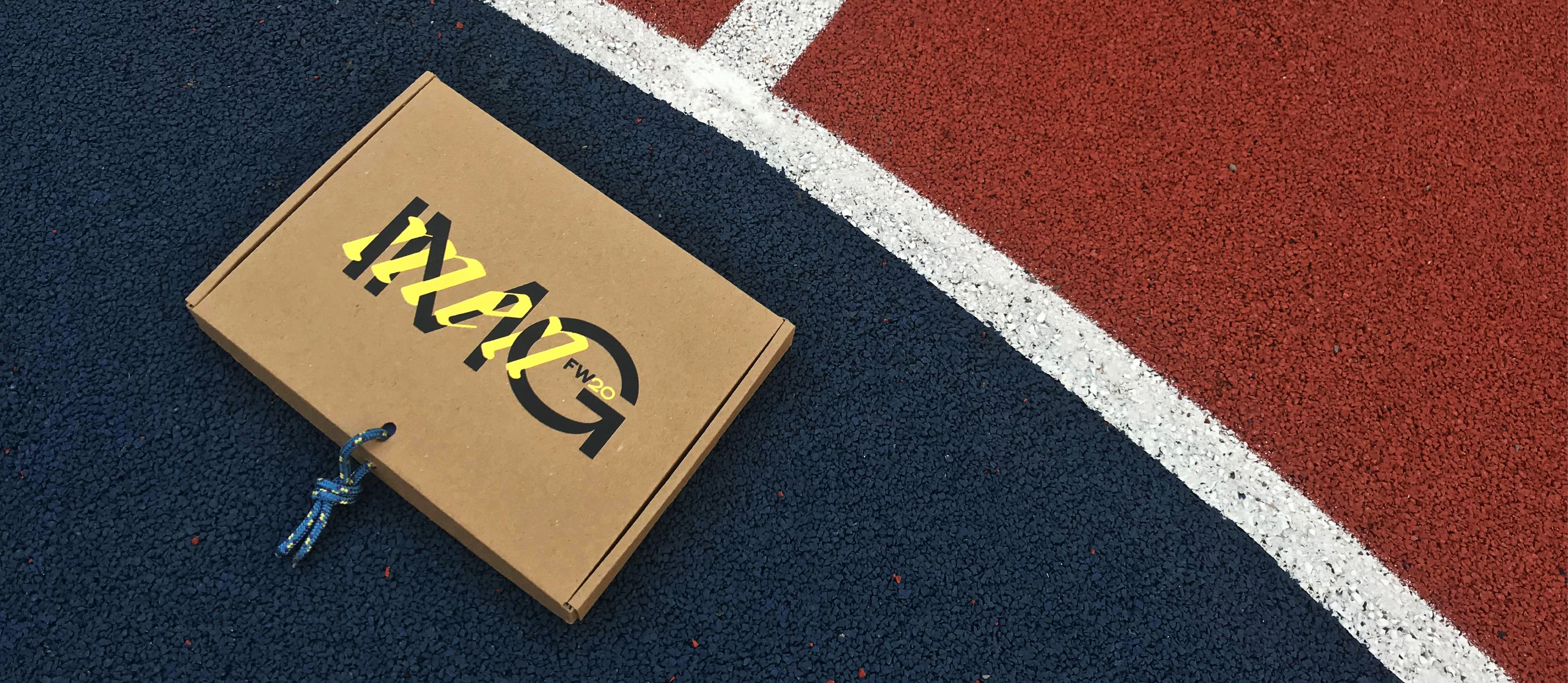
For the packaging, I designed a box that’s both easy to ship and easy to open. Made from cardboard and screen-printed, it reflects an eco-conscious approach. I added hiking cords to bring in pops of color and reinforce the sporty theme.
Services :
Visual Identity
Art Direction
Logotype
Packaging
Casting Cards layout


